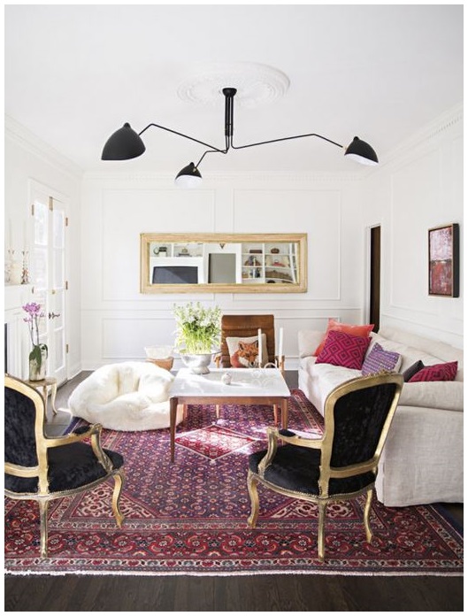
Photo via Domino
As previously stated, I am not keen on this years Pantone Color of the Year – Marsala. Described as “a naturally robust and earthy wine red”, this color is stuck somewhere between the renaissance era and Sedona, AZ. (I feel dizzy just thinking about that connection). The color is a bit confusing. And maybe that’s why I have been hesitant about using the color in home decor. I can’t really place where it came from or where it should go.
But today I read Decor8’s post 8 Ways to Decorate With Marsala: Pantone Color of the Year 2015. And surprisingly, I just might get on board with this unique shade of red. Holly Becker’s photo’s and tips were very insightful, and I enjoyed her fresh perspective. I’m still not fond of Marsala, but I could see that if used in moderation, it could be quite lovely. So check out the post and tell me what you think.
Is this years Pantone color a yay or nay?
Comments 2
I think yay!!! I’m pro almost every color when mixed with the right others. I love the Marsala meshed with peachy-pinks and bright lavenders….. caramels and other warm earthy shades. I say let’s embrace it and make it delicious!!!!
Author
I love the idea of mixing Marsala with peachy-peachy pinks, bright lavenders and caramels. And now that I think of it, your paintings would look smashing with this shade of dusty red. Thanks for your thoughts! XO